SEO-friendly website design is not just about how a site looks. It is about how easily people can use it, how clearly search engines can understand it, and how well it supports business goals such as enquiries, purchases, and sign-ups.
The right design tools can help teams plan layouts, test mobile usability, improve page speed, and build cleaner user journeys. For website owners, designers, marketers, and developers, that means a more practical approach to UX and a stronger foundation for search visibility.
What SEO-Friendly Website Design Really Means
SEO-friendly website design combines visual design, content structure, technical performance, and usability. A site can look polished but still underperform if search engines struggle to crawl it or visitors cannot find what they need quickly.
Good design supports SEO through clear navigation, logical page hierarchy, accessible content, fast loading times, and responsive layouts. It also helps users move through the site with less friction, whether they are reading a blog post, browsing product pages, or completing a contact form.
In practice, this means designing for both people and search engines. Pages should be easy to scan, links should be easy to follow, and important content should not be hidden behind cluttered layouts or slow-loading elements.
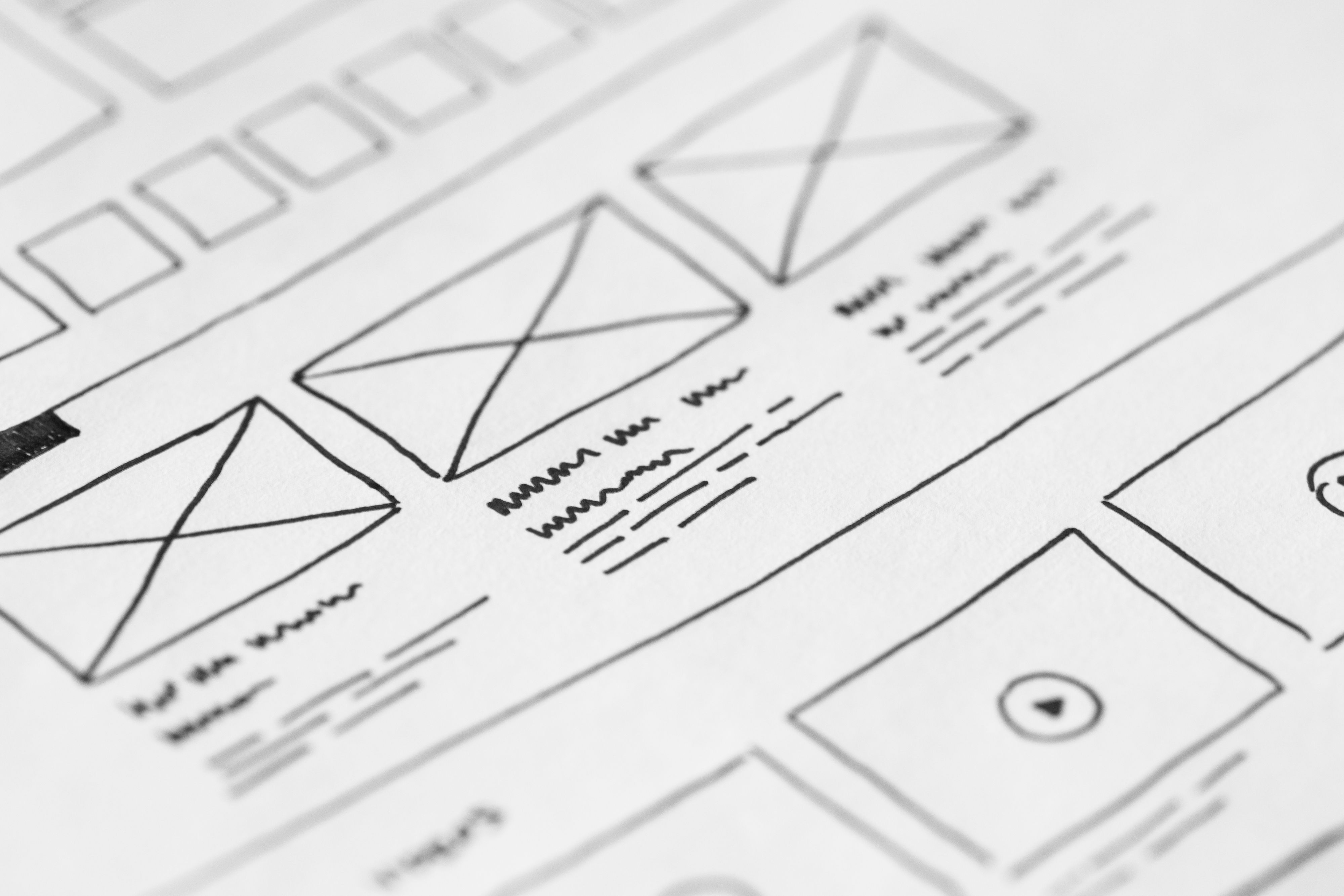
Tools That Help With UX, Layout, and Planning
Before anyone starts building, wireframing and prototyping tools can help define the structure of a site. Tools such as Figma are useful for mapping page layouts, exploring component ideas, and aligning design decisions with content priorities.
For example, a service business might use wireframes to plan a homepage, service pages, case studies, and a contact page. That early planning makes it easier to create a clear website structure with sensible calls to action, visible trust signals, and straightforward navigation.
These tools are especially useful for:
Designing mobile-first layouts
Testing how content reflows across screen sizes
Planning landing pages with one clear action
Keeping product pages consistent across ecommerce catalogues
If you are reviewing your overall site approach, a free website SEO audit can help identify where design and structure may be affecting performance.
Responsive and Mobile-First Design Tools
Responsive design is essential because users move between phones, tablets, laptops, and larger desktop screens. Mobile-first design goes a step further by prioritising the smallest screens first, which often leads to simpler layouts and better focus.
Design tools should help teams preview breakpoints, check spacing, and make sure content remains readable without zooming or sideways scrolling. This is particularly important for menus, forms, image galleries, and product pages, where mobile interaction needs to be effortless.
Search engines also place strong emphasis on mobile usability. A responsive site is easier to crawl, easier to use, and less likely to create frustration for visitors who arrive from search or social channels.
When choosing tools, look for features such as responsive previews, reusable components, and clean handover options for developers. These reduce the risk of design inconsistency once the site is built.
Website Speed, Core Web Vitals, and Performance Checks
Website performance is a design issue as much as a technical one. Heavy images, too many animations, large fonts, and unnecessary scripts can slow pages down and affect user experience.
Design teams should use tools that help them spot performance bottlenecks early. Google’s PageSpeed Insights is useful for checking performance signals and identifying opportunities to improve loading behaviour. It is not a design tool in the traditional sense, but it is highly relevant when evaluating whether a layout is too heavy or complex.
Core Web Vitals matter because they reflect how users experience page loading, responsiveness, and layout stability. Good design helps reduce unexpected movement, keeps important content visible, and avoids overloading the page with elements that do not support the user task.
Common performance-friendly design habits include compressing images, limiting custom scripts, using consistent spacing, and choosing lightweight themes or components. These choices are especially important for WordPress website design and ecommerce website design, where too many plugins or product assets can slow things down.
Designing Clear Paths for Conversions
Conversion-focused design is about making the next step obvious without becoming pushy. That could mean booking a consultation, adding a product to basket, downloading a guide, or sending an enquiry.
Good tools help teams test whether the layout supports that goal. For example, the most important message should appear early on a landing page, while service pages should explain the offer, show trust signals, and make contact details easy to find. Product pages should keep pricing, specifications, images, reviews, and delivery information organised and easy to scan.
Conversions depend on many factors, including traffic quality, user intent, copy, trust, and testing. Design supports the process by reducing confusion and helping visitors understand what to do next. It should never rely on misleading buttons, fake urgency, or hidden content.
A practical way to improve is to review one page type at a time: homepage, service page, product page, or landing page. Check whether the page answers the user’s likely questions quickly and whether the call to action feels natural.
Website Structure, Accessibility, and Content Layout
Strong website structure helps search engines and users understand how the site is organised. That includes the relationship between pages, the way headings are used, and how internal links guide visitors through related content.
Accessibility is part of this too. Readable contrast, sensible heading order, keyboard-friendly navigation, descriptive link text, and alt text for important images all improve usability. They also make the site more inclusive and easier to navigate in general.
Content layout matters on business websites, blogs, and ecommerce sites alike. Short paragraphs, clear subheadings, and scannable sections help visitors absorb information quickly. On service pages, this might mean placing benefits, proof points, and FAQs in a logical order. On blog pages, it may mean using a strong introduction, structured headings, and internal links to related resources.
For teams building or redesigning sites, it helps to think in templates. Consistent page types make content easier to manage and reduce the chance of design drift across the site. If your internal linking or overall site structure needs work, Backlink Works’ backlink building process can be a useful reference point for thinking about how pages connect across a wider website strategy.
Practical Best Practices When Choosing Website Design Tools
When comparing website design tools, focus on how well they support real website work rather than surface-level visuals alone. A helpful tool should make it easier to plan responsive layouts, collaborate with others, and check whether a design will work in practice.
Useful criteria include:
Responsive preview support
Component or template libraries
Clear handover to developers
Compatibility with WordPress or ecommerce platforms
Ability to test page structure before launch
Integration with analytics or usability testing tools
It is also worth reviewing the content workflow. The best design is one that supports future updates, whether you are adding new service pages, expanding an ecommerce catalogue, or publishing more blog content.
If you need a broader starting point for site quality and visibility, Backlink Works offers educational resources that sit alongside wider SEO and website growth planning.
Conclusion
SEO-friendly website design is about more than appearance. It brings together mobile usability, speed, structure, accessibility, content layout, and conversion-focused thinking so that a website works well for both visitors and search engines.
The best tools help teams design with clarity, test ideas early, and avoid costly mistakes later. Whether you are building a business website, service page, product page, or WordPress site, the aim is the same: create a better user experience that supports visibility and business growth over time.
Frequently Asked Questions
What makes a website design SEO-friendly?
An SEO-friendly design is easy to crawl, mobile responsive, fast, accessible, and structured so users and search engines can find important content quickly.
Which design tools are useful for responsive layouts?
Tools that support wireframes, breakpoints, and live previews are most useful because they help you check how a page behaves on different screen sizes.
How does website design affect conversions?
Design affects clarity, trust, and ease of use. A clear layout and strong page structure can support conversions, but results depend on traffic quality, offer strength, copy, and testing.
Should WordPress sites use special design tools?
Yes, especially if you want to manage templates, improve speed, and keep layouts consistent. The best tools depend on your theme, editor, and workflow.
- Sponsored Ad -


