Landing pages sit at the point where design, search visibility, and user experience meet. A well-built landing page should help visitors quickly understand what the page offers, find the information they need, and take the next step without friction.
For SEO and business growth, landing page design is not just about appearance. It affects crawlability, mobile usability, page speed, content clarity, trust, accessibility, and how easily people can complete an action such as making an enquiry, downloading a guide, or browsing a product range.
What Makes a Landing Page SEO-Friendly?
An SEO-friendly landing page is designed so search engines and users can both understand it. That means clear page structure, descriptive headings, useful content, and a layout that supports scanning rather than confusion. If a page has a vague headline, thin content, or hidden key information, it becomes harder for search engines to assess relevance and harder for visitors to stay engaged.
For example, a service landing page should explain what is offered, who it is for, where it applies, and what makes the service useful. A product landing page should support product discovery with concise details, clear images, and easy-to-find calls to action. The design should make the page feel organised, not crowded.
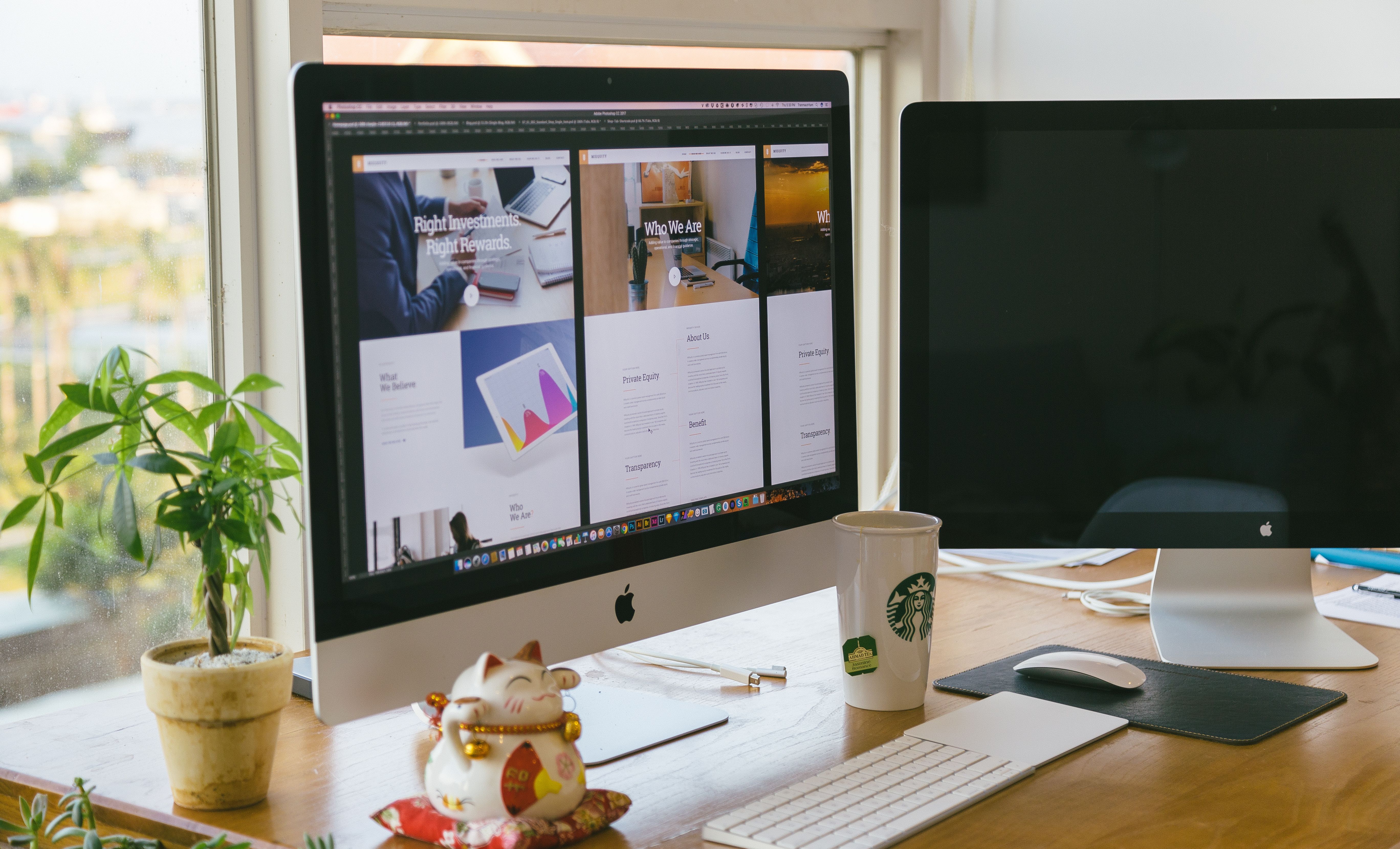
Search visibility also depends on technical basics such as indexable content, internal linking, and accessible HTML. If the page is built in WordPress, using a clean theme and sensible block structure can help keep the design lightweight and easier to maintain.
Start with a Clear Page Goal and Strong Layout
Every landing page needs one main purpose. That may be lead generation, a sign-up, a booking request, a product purchase, or directing visitors deeper into the site. When the goal is clear, the layout can support it properly.
Place the most important message near the top of the page. Use a headline that explains the offer in plain language, followed by a short supporting paragraph. The visitor should not need to scroll around to work out what the page is about.
After that, build the page in a logical order. A typical structure might include:
headline, supporting copy, key benefits, proof or trust signals, detail sections, and a clear call to action. This type of content layout helps both user experience and search engines by making the page easier to read and interpret.
Design for Mobile-First and Responsive Use
Many visitors will arrive on a landing page from a mobile device, so mobile-first design should be a priority rather than an afterthought. Buttons need enough space around them, text must be readable without zooming, and key content should not be pushed too far down the page.
Responsive web design ensures the page adapts to different screen sizes, but good mobile UX goes further. It means keeping forms short, avoiding oversized banners that dominate the screen, and making sure menus, accordions, and content blocks work smoothly on touch devices.
For ecommerce website design, this is especially important on product pages. If product images, prices, delivery details, and add-to-cart buttons are not easy to access on mobile, the page may frustrate users even if the design looks polished on desktop.
Improve Speed and Core Web Vitals
Website speed is part of design. A beautiful landing page that loads slowly can hurt user experience and reduce engagement. It can also make it harder for search engines to interpret the page as a strong result for users.
To improve performance, keep layouts clean, compress images, avoid unnecessary scripts, and choose lightweight WordPress plugins or page builders where possible. If animations are used, they should support the page rather than distract from it.
Core Web Vitals are useful indicators of page performance and visual stability. Google’s own PageSpeed Insights tool can help you identify issues that affect loading, interactivity, and layout shift. For landing pages, that means fewer surprises for users and a better chance of keeping attention on the page content.
Use Trust Signals, Navigation, and Internal Links Carefully
Landing pages should stay focused, but they still need enough trust and context to feel credible. Clear contact details, consistent branding, secure checkout signals, testimonial snippets where genuine, and privacy or policy links can all help build confidence.
Navigation depends on the page purpose. Some campaign landing pages benefit from limited navigation so visitors stay on task. Business websites and service pages, however, often need a balanced structure with clear links to supporting pages such as pricing, FAQs, or related services. The goal is not to trap users, but to guide them clearly.
Internal linking can also support SEO by helping users and search engines understand how pages relate to each other. For example, a landing page may link naturally to a broader website overview or a free SEO review such as the free website SEO audit. Used well, internal links improve discoverability without turning the page into a cluttered hub.
Write for Clarity, Accessibility, and Conversion
Good landing page design should make content easier to understand, not just easier to look at. Use short paragraphs, descriptive subheadings, and simple language. Break complex information into digestible sections. This helps users skim the page and find the details that matter most.
Accessibility is part of user experience too. Use sufficient colour contrast, legible font sizes, descriptive link text, and proper heading hierarchy. If images convey important information, make sure they are supported by text. Accessible design helps more people use the page effectively and supports better overall content structure.
Conversion-focused design should remove friction. Keep forms as short as possible, reduce unnecessary fields, and make the next step obvious. However, results depend on traffic quality, offer relevance, page clarity, trust signals, copy, testing, and user intent. Good design helps, but it does not guarantee outcomes.
Landing Page Design Best Practices to Review Before Publishing
Before launching, check the page as a visitor would. Ask whether the value proposition is clear within a few seconds, whether the CTA stands out, and whether the page feels easy to navigate on mobile. If the answer is unclear, the design may need simplifying.
It is also worth reviewing the page with search and performance in mind. Confirm that headings are organised properly, images have sensible file sizes, and the page loads cleanly. For broader technical checks, a resource like the Google Search Essentials guide can be useful when aligning design with SEO fundamentals.
Backlink Works often discusses website growth from a practical design and SEO angle, and the same principle applies here: the best landing pages balance clarity, speed, and intent rather than relying on visual flair alone.
Conclusion
Landing page design has a direct impact on SEO-friendly website design and user experience. When a page is structured clearly, loads quickly, works well on mobile, and supports the visitor’s next step, it becomes more useful for both users and search engines.
Whether you are building a service page, ecommerce product page, or a WordPress landing page for lead generation, focus on simplicity, accessibility, and performance. A thoughtful layout, strong content hierarchy, and clear trust signals can make the page easier to use and easier to understand.
In practice, the best landing pages are not the busiest ones. They are the ones that guide visitors smoothly from interest to action with as little friction as possible.
Frequently Asked Questions
What is the most important part of landing page design?
The most important part is clarity. Visitors should quickly understand the offer, who it is for, and what to do next.
Does landing page design affect SEO?
Yes. Design affects crawlability, mobile usability, speed, content structure, accessibility, and internal linking, all of which support SEO.
Should landing pages have navigation menus?
It depends on the goal. Some pages work better with limited navigation, while business and service pages may need links to supporting content.
How can I improve conversions without making the page pushy?
Keep the message clear, reduce distractions, use strong trust signals, and make the next step easy to understand. Clear design usually works better than aggressive tactics.
- Sponsored Ad -


