
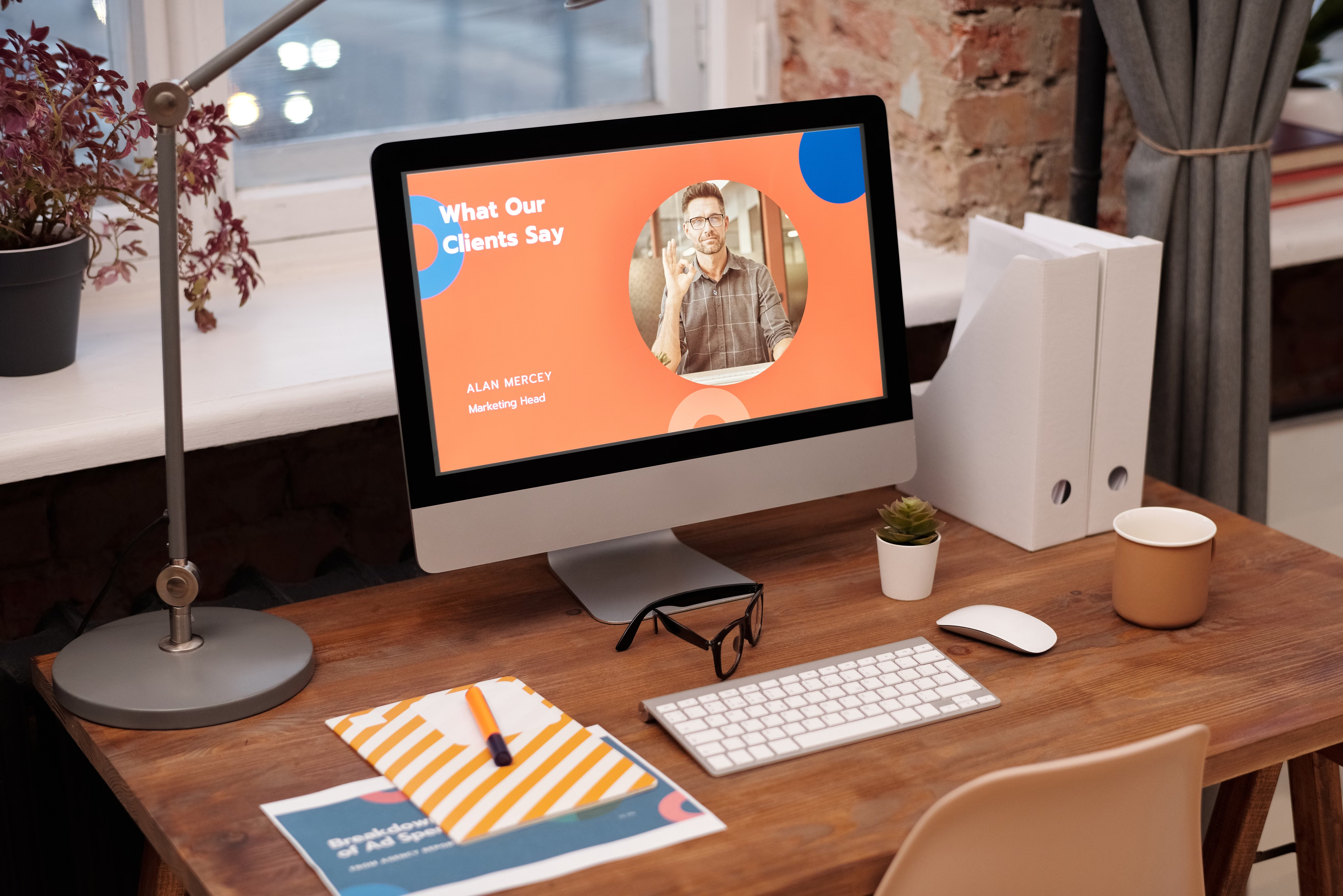
A well-planned blog layout does more than make a site look tidy. It helps visitors find what they need faster, read with less friction, and move through the site with more confidence. For businesses, that can support stronger engagement, better trust, and a smoother path to enquiries or purchases.
In website design, blog layout sits at the intersection of SEO-friendly structure, mobile usability, speed, accessibility, and conversion-focused design. When the layout is clear, responsive, and easy to scan, both users and search engines can understand the content more effectively.
What Blog Layout Design Actually Does
Blog layout design is the way content, navigation, headings, images, sidebars, calls to action, and related links are arranged on a page. It is not just about appearance. The layout affects how quickly someone can orient themselves, whether they keep reading, and how easily they can move to another useful page.
For a business website, a blog layout may guide readers towards service pages, product pages, lead magnets, or contact forms. For an ecommerce site, it can support buying decisions by linking to categories, product guides, and comparison content. For a WordPress website, the layout is often shaped by the theme, templates, and blocks used across the site.
Good layout design supports clarity. Poor layout design creates unnecessary effort. If readers cannot find the main point quickly, they are more likely to leave before they reach the content that matters.
How Layout Improves Navigation and Content Discovery
Navigation is easier when a blog page has a clear hierarchy. That usually means a visible headline, a strong introduction, logical subheadings, and a simple path to related content. Readers should be able to skim the page and understand what it covers within seconds.
Internal links also play an important role. Related articles, category links, and contextual links can help users move between pages naturally. This supports website structure and helps search engines understand how content is connected. For SEO, that matters because crawlability and internal linking are part of a healthy site architecture.
Menus, breadcrumb trails, category labels, and featured posts can all improve navigation when used sparingly. The goal is not to add more links everywhere. The goal is to make the next step obvious. For practical SEO planning, a free website SEO audit can help identify structural issues that affect findability and user flow.
Best practice: make scanning effortless
Use short paragraphs, descriptive headings, and clear topic groupings. Readers should be able to scan on desktop or mobile without feeling overwhelmed by dense blocks of text.
Why Blog Layout Affects Website Speed
Layout decisions can influence performance. Large image files, unnecessary scripts, heavy sliders, too many widgets, and cluttered page elements can slow down a blog page. That can affect user experience and Core Web Vitals, especially on mobile devices and slower connections.
A simpler layout often loads more efficiently. Fewer decorative elements mean less page weight and fewer distractions. Clean templates are usually easier to maintain too, particularly in WordPress and ecommerce environments where plugins and page builders can add extra complexity.
Website speed is not only a technical concern. It also affects how people feel while using the site. A fast page feels responsive and trustworthy, while a slow one can create friction before the content even appears. Tools such as PageSpeed Insights can help review performance and highlight issues such as image sizing, render blocking, and layout shifts.
Keep layout elements purposeful
Use featured images, buttons, and embedded content only where they support the page goal. Avoid visual extras that do not help the reader move forward.
Mobile-First and Responsive Design Make a Big Difference
Most blog traffic now starts on smaller screens for many websites, so layout needs to work well on mobile first. Responsive web design ensures content adapts to different screen sizes, while mobile-first design encourages teams to prioritise essential content and actions before adding secondary elements.
On mobile, a good layout should keep text readable, buttons easy to tap, and navigation simple. Sidebars that work on desktop may need to move below the main content on mobile. Images should scale correctly, and headings should break the page into manageable sections.
This is especially important for service pages, landing pages, and product pages linked from the blog. If the blog entry leads to a conversion path, the mobile experience must stay smooth from article to next step. A strong layout helps avoid confusion and supports a clearer journey.
How Layout Supports Conversions Without Being Pushy
Blog pages do not convert in the same way as landing pages, but they can still support conversions by guiding intent. A thoughtful layout can introduce relevant next steps at the right time, such as a consultation page, product category, newsletter signup, or downloadable resource.
Conversion-focused design works best when it respects user intent. Someone reading an educational blog post may not want a hard sell halfway down the page. Instead, a helpful layout can place one clear call to action after a useful section, or at the end of the article, where it feels natural.
Trust also matters. Clear author information, well-structured content, readable typography, and consistent branding all help create a more credible experience. Conversion results depend on many factors, including traffic quality, offer relevance, copy, trust signals, design quality, and testing. Layout supports those elements, but it does not replace them.
Layout Choices That Improve UX, Accessibility, and SEO
User experience and SEO are closely connected. Search engines aim to surface pages that are useful, understandable, and easy to use. A blog layout that improves readability and accessibility can support those goals indirectly through better engagement and clearer content structure.
Accessibility should be part of every layout decision. Good contrast, clear heading order, alt text for meaningful images, and keyboard-friendly navigation all help more people use the site effectively. These are not just compliance concerns; they improve the experience for everyone.
For website owners building on WordPress, layout consistency across posts, categories, and templates is especially useful. It reduces confusion and helps users know where they are on the site. If you want to align layout decisions with search best practice, the Google SEO Starter Guide is a useful reference point.
Simple layout checklist
Before publishing a blog post, check that the page has one clear topic, logical headings, readable spacing, fast-loading images, mobile-friendly formatting, and a visible next step where appropriate.
Common Blog Layout Mistakes to Avoid
One common mistake is treating every page like a homepage. Too many links, banners, and side widgets can distract from the article and weaken the main message. Another issue is using long unbroken text blocks that are hard to scan on mobile.
Other problems include inconsistent styling between posts, oversized media files, hidden navigation, and too many calls to action competing with each other. These issues can reduce clarity and make the site feel less trustworthy.
For ecommerce and business websites, it is also important that blog posts connect cleanly to relevant pages. If a guide mentions a service, category, or product, the link should make sense in context. That supports navigation without feeling forced. If you want to explore content structure and site improvement more broadly, Backlink Works has resources such as the Backlink Works homepage and its site-wide SEO guidance.
Conclusion
Blog layout design influences much more than visual appeal. It shapes navigation, readability, mobile usability, performance, and the ease with which visitors can take the next step. When a layout is clear and responsive, it helps users find answers faster and supports the wider goals of SEO and conversions.
For website owners, the best approach is practical: keep the structure simple, reduce unnecessary clutter, design for mobile first, support internal linking, and review performance regularly. A thoughtful blog layout will not guarantee results, but it can create the conditions for better user experience and stronger website growth over time.
Frequently Asked Questions
How does blog layout help SEO?
It helps search engines understand content structure, supports internal linking, improves mobile usability, and can make pages easier for users to read and navigate.
Does a simpler layout always load faster?
Not always, but simpler layouts often make it easier to reduce heavy assets, unnecessary scripts, and clutter that can slow a page down.
Can blog layout improve conversions?
Yes, if it presents content clearly, builds trust, and guides readers to relevant next steps without distracting them from the main message.
What should I prioritise in a blog layout for mobile?
Prioritise readable text, clear headings, fast-loading media, simple navigation, tap-friendly buttons, and a clean path through the content.
- Sponsored Ad -





