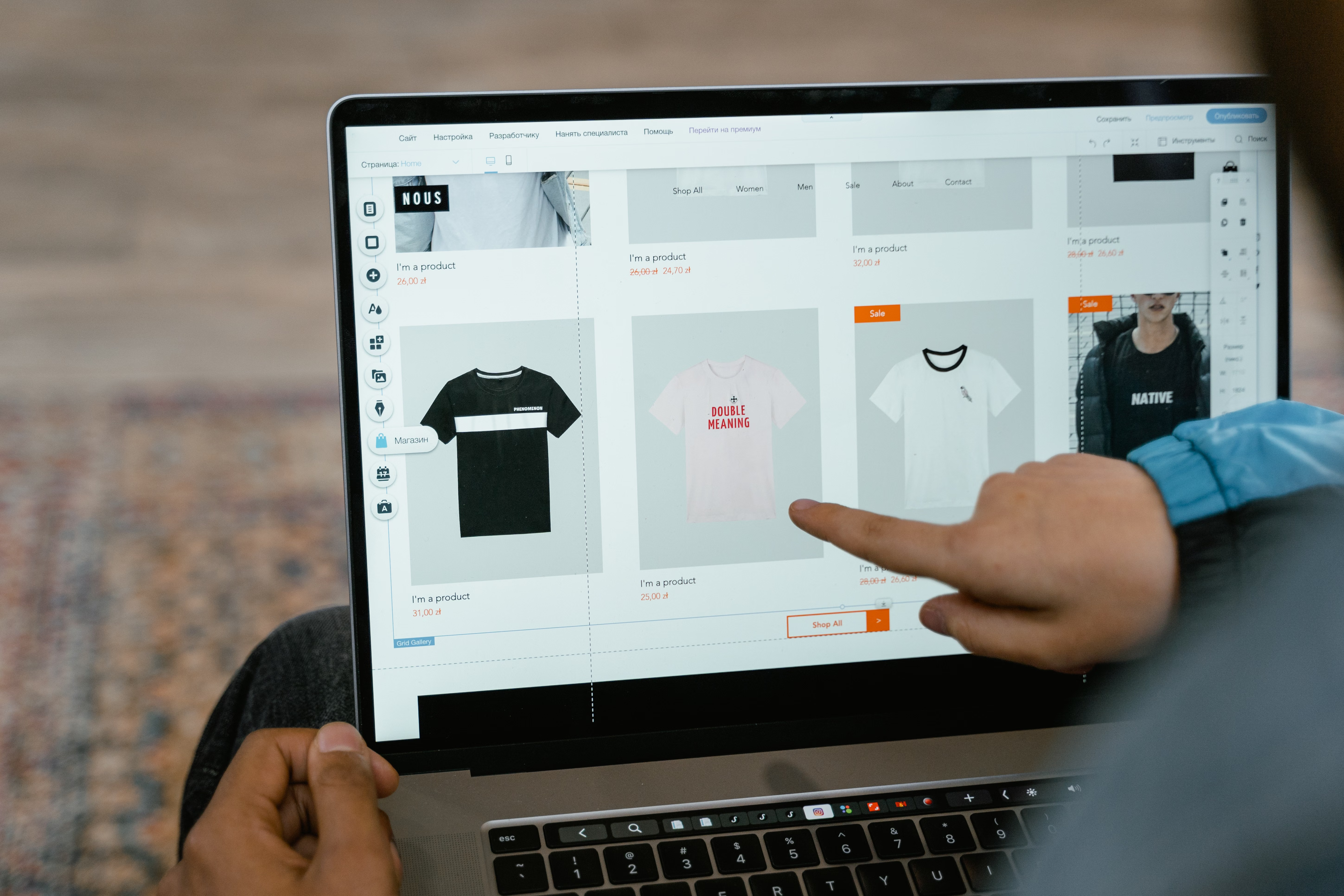
Canva is widely used for creating website mock-ups, landing page concepts, and simple site designs, especially by small businesses, marketers, and teams without a full design department. Used well, it can support SEO-friendly website planning by making page structure, content layout, and visual hierarchy easier to define before a site is built.
The key point is that design itself does not rank pages on its own. SEO-friendly website design works because it improves crawlability, mobile usability, page speed, accessibility, and user experience. In practice, that means your Canva layout should help visitors find information quickly and make it easier for search engines and users to understand each page’s purpose.
What SEO-Friendly Canva Website Design Really Means
When people talk about Canva website design best practices, they usually mean using Canva to plan page layouts, create wireframes, build visual references, and shape content sections before development. This is useful for business websites, service pages, ecommerce landing pages, and WordPress builds because it helps teams agree on structure early.
An SEO-friendly design is one that supports clear navigation, logical headings, mobile-responsive behaviour, and readable content blocks. It should not rely on decorative elements that push key information too far down the page. A clean structure makes it easier for users to scan and for search engines to interpret the page.
If you are mapping a site or reviewing an existing page, a free website SEO audit can help you identify technical and content issues that design choices may be hiding.
Start With Page Purpose, Not Decoration
Every page should have one clear job. A homepage may introduce the brand and direct people onwards. A service page should explain the offer, build trust, and guide visitors to enquire. A product page should reduce friction and answer buying questions. Canva works best when the layout is built around that purpose rather than around visual flair alone.
Before designing, define the main action you want the visitor to take. Then place the most important content near the top of the page: value proposition, supporting proof, key benefits, and a clear call to action. This helps conversion-focused design without making false promises about results, because performance still depends on traffic quality, offer clarity, trust signals, and testing.
Useful layout rule
Use one primary message per page section. If a section tries to explain too much at once, users may miss the point. Simple layouts usually support better readability and stronger content hierarchy.
Design for Mobile-First and Responsive Behaviour
Most website visits now happen on smaller screens, so your Canva layout should be checked for mobile readability first. Even if Canva is used only for planning, it should reflect how a page will work on phones: stacked sections, larger tap targets, concise text blocks, and fewer side-by-side columns.
Responsive web design is about more than shrinking desktop content. Buttons should remain easy to tap, text should not become cramped, and images should not crowd important copy. A mobile-first approach also helps you avoid layouts that look good on a large canvas but break down in real usage.
For practical guidance on responsive and mobile-friendly design principles, Google’s design learning resources are a useful reference.
Mobile-friendly checklist
Keep paragraphs short. Use a single-column structure where possible. Make the CTA visible without excessive scrolling. Avoid tiny text, narrow spacing, and oversized graphics that slow the page down.
Use Clear Content Structure and Visual Hierarchy
Website structure is one of the most important parts of SEO-friendly design. Search engines and users both benefit when the page has a logical order: headline, introduction, supporting details, proof, FAQs, and action points. Canva can help you prototype this sequence before a page is built in WordPress, Shopify, Webflow, or another platform.
Visual hierarchy means the most important items stand out first. Use heading levels, spacing, contrast, and section order to guide attention. On service pages, that may mean leading with the service outcome, then process, then testimonials or credentials, and finally contact details. On ecommerce product pages, it may mean product summary, price, benefits, specifications, reviews, and delivery information.
Good content layout also supports internal linking. If a page includes links to related services, category pages, or supporting guides, visitors can move through the site more naturally. That can improve engagement and help search engines understand page relationships.
Keep Speed and Core Web Vitals in Mind
A visually polished design is only useful if the page performs well. Website speed affects user experience, and poor performance can frustrate visitors on both desktop and mobile. Canva mock-ups often include large images, decorative blocks, and complex sections, but those ideas should be simplified before development.
To support Core Web Vitals, keep layouts efficient: use compressed images, avoid unnecessary animations, and minimise heavy components that delay rendering. If a design depends on multiple large visuals, check whether they are all essential. Fast-loading pages are easier to use and usually easier to maintain.
If you want a quick performance check during planning, PageSpeed Insights is a practical tool for spotting common speed and layout issues.
Design choices that often slow pages down
Very large hero images, background videos, too many fonts, and cluttered sections can all add weight. In a Canva concept, these features may look attractive, but the build should balance visual appeal with speed and stability.
Design for Accessibility, Trust, and Conversion Clarity
Accessible design helps more people use your site and supports better usability overall. In practical terms, this means readable font sizes, strong colour contrast, clear labels, and layouts that do not depend on colour alone to communicate meaning. These decisions matter for users with visual, motor, or cognitive challenges, but they also improve clarity for everyone.
Trust signals should be built into the page layout, not added as an afterthought. For business websites and service pages, that may include contact details, business location, accreditations, case studies, team information, or service guarantees where they are genuine. For ecommerce pages, it may include product specifications, delivery information, returns policy, and honest reviews.
Canva can help you position these trust elements in a sensible order, so they support the decision-making process without overwhelming the page. For teams using WordPress, this often translates into reusable sections that can be applied consistently across site templates.
Plan Navigation and Page Templates for Real Users
Navigation should help visitors move through the site with minimal effort. Good website design includes menus that reflect user intent, not internal jargon. For example, a service business may use clear labels such as “SEO Services”, “Website Design”, or “Contact”, while a product site may use category names that match how customers search and browse.
Canva is useful for sketching page templates for homepages, service pages, product pages, and landing pages. Each template should solve a different problem. A homepage should direct visitors to the right area. A service page should explain what is included. A product page should support purchase decisions. A landing page should stay focused on one campaign or offer.
For website owners who also think about link strategy and site growth, the backlink building process explains how off-page work fits into broader online visibility efforts, while the design itself keeps the site usable and clear.
Common website design mistakes to avoid
Do not bury the main call to action. Do not overload the page with unnecessary sections. Do not use vague headings that hide the page purpose. And do not design for aesthetics alone if the layout makes the page harder to scan on mobile.
Conclusion
Canva can be a helpful tool for designing SEO-friendly pages when it is used to plan structure, hierarchy, responsiveness, and content flow rather than just visuals. The strongest website designs make it easier for users to understand the page, find what they need, and take the next step.
If you are building a business website, ecommerce page, or WordPress site, focus on clarity first: mobile usability, fast loading, accessible layout, logical navigation, and content that matches user intent. That approach supports SEO, improves user experience, and creates a better foundation for growth over time. Backlink Works shares practical guidance like this for teams that want to improve online visibility without relying on shortcuts.
Frequently Asked Questions
Can Canva be used for SEO-friendly website design?
Yes, mainly for planning layouts, content sections, and visual hierarchy. The actual SEO value comes from how the site is built and optimised.
What should I prioritise in an SEO-friendly page layout?
Focus on clarity, mobile usability, fast loading, and a logical structure with headings, content, and calls to action in the right order.
Does design affect website conversions?
Yes, but results depend on traffic quality, offer strength, trust signals, copy, and testing as well as design.
Is Canva enough to design a full website?
Canva is useful for concepts and planning, but a live website still needs proper development, performance optimisation, and content management.
- Sponsored Ad -


