Landing pages have a simple job: help people understand an offer quickly and take a clear next step. On mobile, that job becomes more demanding because screen space is limited, attention is brief, and small design choices have a bigger effect on usability.
That is why mobile-first layout planning matters. A strong landing page structure supports SEO-friendly website design, improves page speed and accessibility, and makes it easier for visitors to scan content, trust the page, and act. For Backlink Works Insights, this sits squarely within practical website design rather than visual styling alone.
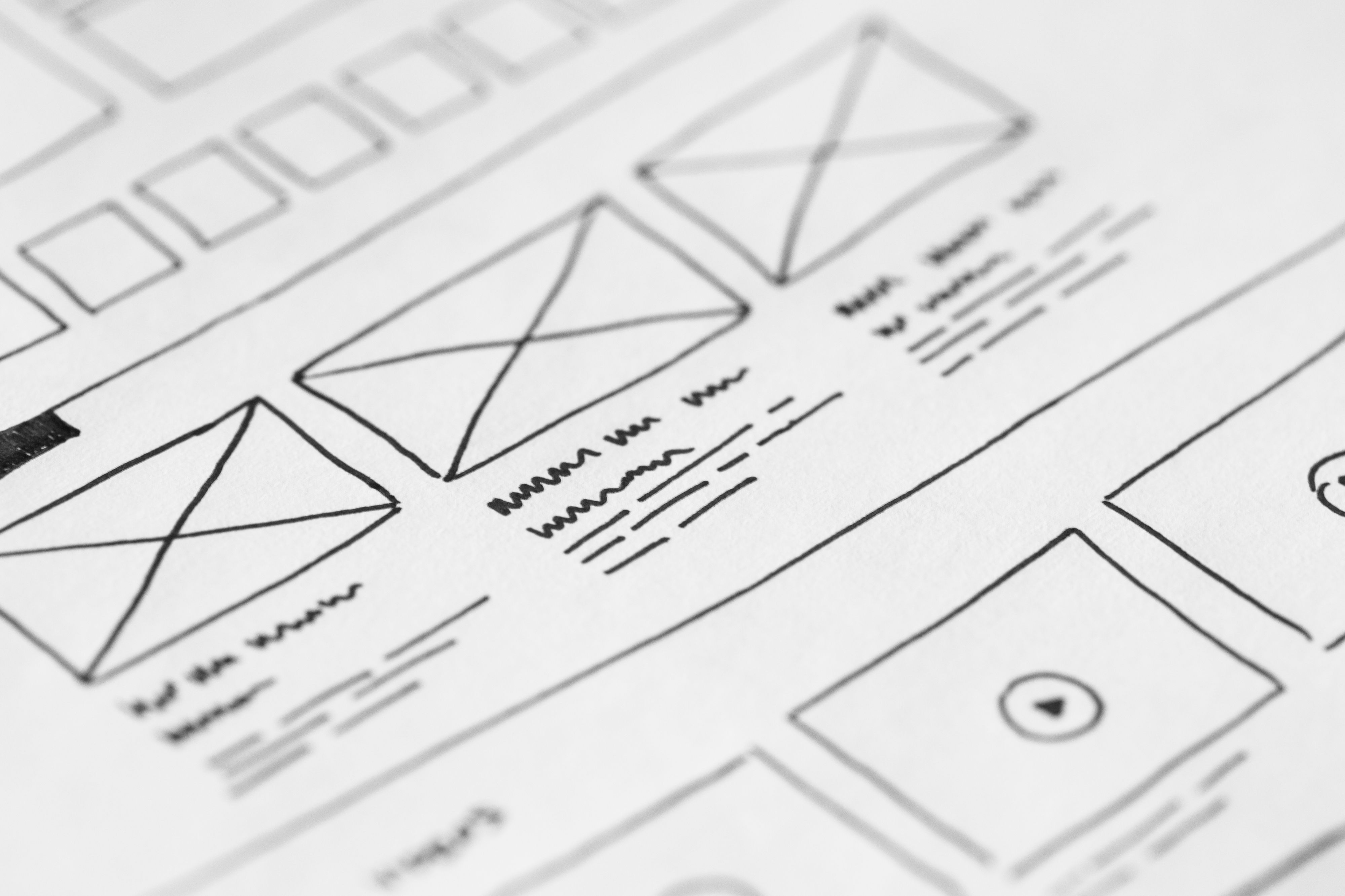
What Mobile-First Landing Page Layout Means
Mobile-first design starts with the smallest screen and builds upwards. Instead of shrinking a desktop layout to fit a phone, the page is planned around mobile behaviour first: quick scanning, thumb-friendly navigation, clear hierarchy, and minimal friction.
For landing pages, that means every section should earn its place. The page needs a focused headline, a concise explanation of the offer, relevant proof, a clear call to action, and content that answers likely questions without overwhelming the user. This structure helps both users and search engines understand the page.
In SEO terms, design supports crawlability and relevance by keeping content organised, readable, and linked logically to related pages. In UX terms, it reduces confusion and makes the next step obvious.
Start With a Clear Above-the-Fold Structure
The top of the page is where many users decide whether to stay. On mobile, the above-the-fold area should communicate the offer in seconds. A useful layout usually includes a short headline, a supporting line of copy, one primary action, and a visual or product cue that adds clarity rather than clutter.
Avoid placing too many links, menus, or competing buttons near the top. A landing page works best when the main action is easy to spot and the page does not require much interpretation. If the page is for a service business, the first screen might highlight the service outcome and a contact or quote request button. For ecommerce, it may feature the product value and a buy or add-to-basket action.
If you need more context on how search visibility and structure work together, Google’s SEO starter guide is a helpful reference point.
Design for Scanning, Not Just Reading
Mobile users rarely read every line immediately. They scan for cues that confirm the page is relevant. Good landing page layout supports that behaviour with short sections, strong headings, and enough spacing to make the page easy to move through.
Use one idea per section where possible. Break long blocks of text into short paragraphs, and avoid burying key information in dense content. Lead with the most important detail, then add supporting explanation. This is especially useful for service pages, product pages, and campaign landing pages where visitors often compare options quickly.
Visual hierarchy matters too. Headings should be descriptive, body copy should be readable, and buttons should stand out without dominating the page. Consistent spacing, font sizing, and contrast help users follow the content flow and reduce friction on smaller screens.
Keep Navigation Minimal but Helpful
Landing pages do not need full website navigation in every case. Too many menu items can distract from the page goal. However, mobile-first UX still needs orientation and trust. The right balance depends on the intent of the page and the audience.
For dedicated campaign pages, a simplified header or sticky action area can help users move without losing focus. For business websites or service pages, a small set of supportive links may be useful, especially if visitors need reassurance before enquiring. Internal links to related content can also help with website structure and SEO, as long as they are genuinely useful and not distracting.
Navigation should never hide important content or make key actions hard to reach. The aim is clarity: give users a smooth path without forcing them to hunt for basic information.
Optimise for Speed, Accessibility and Core Web Vitals
Layout and performance are closely connected. Heavy design elements, oversized images, and unnecessary scripts can slow down a landing page, which harms mobile usability and may weaken user engagement. Faster pages usually create a better experience, particularly on mobile networks, but performance still depends on the full technical setup.
Keep the design lean. Use appropriately sized images, avoid layout shifts, and make sure buttons and content do not jump around as the page loads. These choices support Core Web Vitals and help the page feel stable. Accessibility also matters: text should have good contrast, tap targets should be large enough, and form fields should be labelled clearly.
For performance testing, tools such as PageSpeed Insights can help identify practical improvements. If you build in WordPress, theme choice, plugin use, and image handling all affect the final result.
Place Trust Signals and Conversion Elements Where They Make Sense
Mobile-first landing pages should guide action without feeling pushy. Trust signals such as testimonials, client logos, guarantees with clear terms, product details, delivery information, or contact details can reduce hesitation. The best placement depends on the offer and the page length.
For a short landing page, one or two trust elements near the call to action may be enough. For more considered purchases or service enquiries, it may help to include proof sections, FAQs, and a short process explanation. This is often useful for consultants, agencies, local businesses, and ecommerce brands where visitors need reassurance before they commit.
Conversion-focused design does not guarantee results. Performance depends on traffic quality, offer clarity, page copy, user intent, trust, and testing. Strong layout simply removes friction and makes it easier for the right visitor to take the next step.
Common Mobile Landing Page Mistakes to Avoid
Several layout issues can weaken both UX and SEO. A common mistake is treating the mobile page like a compressed desktop page, which often leads to cramped text, cluttered buttons, and difficult scrolling. Another is adding too many competing calls to action, which can confuse visitors.
Avoid hiding essential content in tabs if that content is important for understanding the offer. Do not use intrusive pop-ups that block the page on arrival. Also be careful with image-heavy hero areas that look impressive but slow the page down.
A simple best-practice checklist for mobile landing pages:
- Keep the main message visible early.
- Use one primary call to action per section.
- Break content into short, readable blocks.
- Make tap targets easy to use.
- Test the page on real mobile devices, not just a desktop preview.
For teams improving broader website visibility, a free website SEO audit can be a useful starting point for identifying design and structure issues that affect discovery and usability.
Bringing It Together for Business Websites and Ecommerce
The best mobile-first landing page layouts are not just tidy; they are purposeful. They guide attention, support search visibility, and make the journey from first impression to action feel straightforward. Whether the page is for a business website, an ecommerce product, a service page, or a WordPress-built campaign, the same principles apply: clarity, speed, hierarchy, and relevance.
Designing with mobile users in mind also improves the desktop experience in many cases, because the page becomes more focused and content is organised more intelligently. If you are planning a new landing page or revising an existing one, start with the user’s needs, then shape the layout around the action you want them to take. If backlink strategy is also part of your wider visibility plan, Backlink Works can sit alongside a solid design and content foundation rather than replacing it.
Conclusion
Landing page layout best practices for mobile-first UX come down to making the page easy to understand, easy to trust, and easy to act on. That means a clear above-the-fold message, scannable content, minimal distraction, fast loading, accessible design, and a structure that supports both users and search engines.
When website design is planned well, it improves usability, strengthens content clarity, and gives your SEO and conversion efforts a better foundation. The goal is not to overwhelm visitors with more design, but to remove the barriers that prevent them from moving forward.
Frequently Asked Questions
What should be above the fold on a mobile landing page?
A clear headline, a short supporting line, one primary call to action, and a visual that helps explain the offer.
Do landing pages need navigation on mobile?
Not always. Keep it minimal and only include links that genuinely help users understand or trust the page.
How does landing page layout affect SEO?
It supports SEO through mobile usability, content structure, accessibility, internal linking, crawlability, and user experience.
What is the biggest mobile landing page mistake?
Trying to fit a desktop layout onto a phone screen, which often creates clutter, slow loading, and unclear actions.
- Sponsored Ad -


