
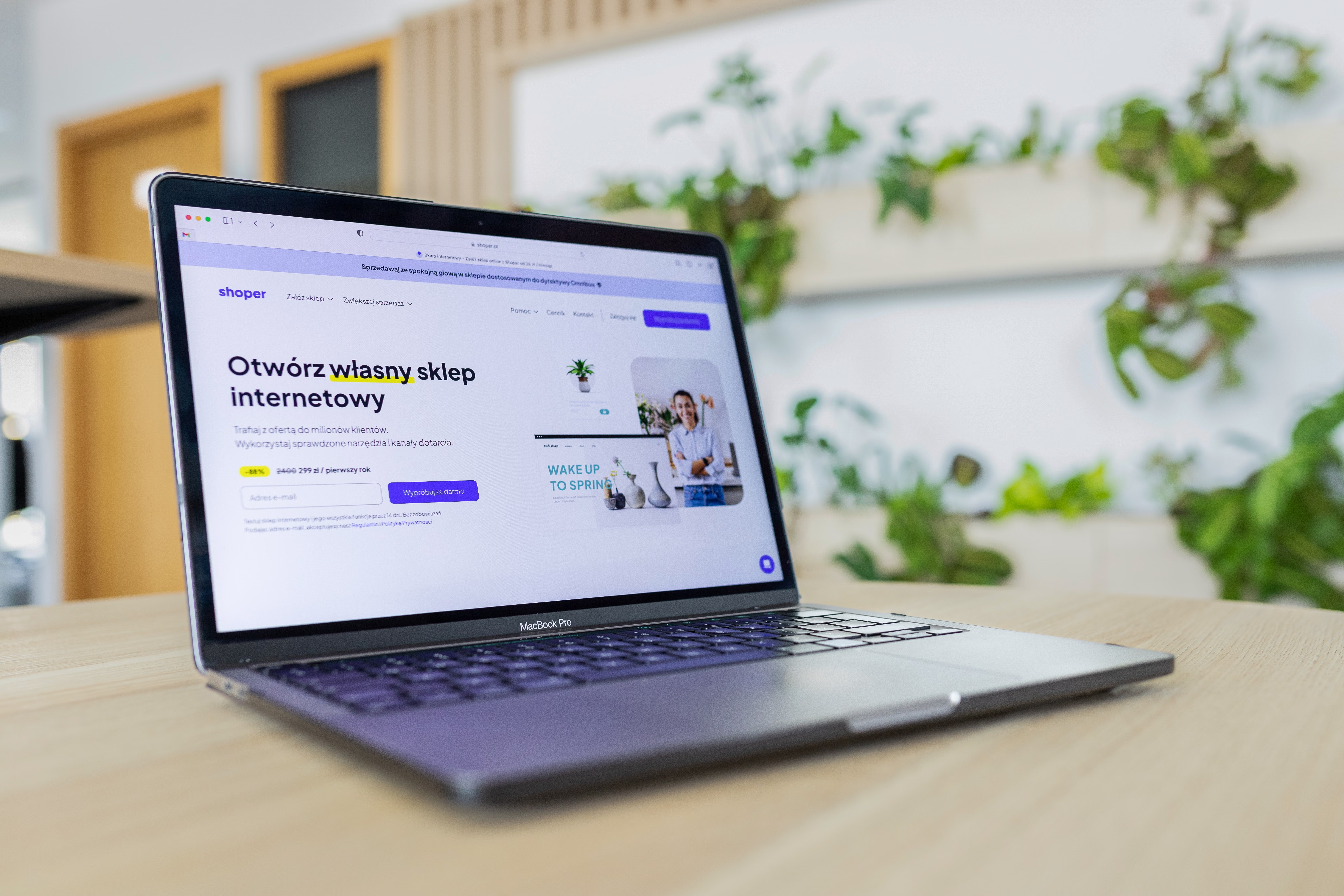
Mobile-first website design is no longer just a layout choice; it is a practical way to build sites that feel faster, clearer, and easier to use on small screens. For many visitors, the mobile version is the main version they experience, so design decisions made for phones now shape usability, search visibility, and conversion potential.
A strong mobile-first approach supports SEO-friendly website design by improving crawlability, page speed, content structure, accessibility, and user experience. It also helps business websites, ecommerce stores, service pages, and landing pages present the right information without clutter or delay.
What Mobile-First Website Design Means
Mobile-first design starts with the smallest screen and works upwards. Instead of building a large desktop layout and then shrinking it down, you begin with the most essential content, actions, and navigation. This approach usually leads to cleaner page layout, simpler user flows, and better performance.
From an SEO perspective, mobile-first design is helpful because it encourages clearer structure and better usability. Search engines need pages that are easy to crawl and understand, while visitors need pages that load quickly and make sense on touch devices. The same principles support both goals.
For WordPress website design, ecommerce builds, and service websites, this means planning content blocks carefully. A mobile visitor should be able to find the main message, key benefits, trust signals, and next step without excessive scrolling or confusion.
Start With Content Priorities and Page Structure
Before choosing fonts or colours, decide what belongs at the top of the page. Mobile users rarely have patience for unnecessary sections, so your first screen should communicate the page purpose clearly. For a service page, that may be the service name, a short value statement, and a clear call to action. For a product page, it may be the product name, price, key features, and add-to-basket button.
Use a simple structure that moves from core message to supporting detail. This usually means hero section, benefits, proof, details, and action. Avoid forcing visitors to hunt for basic information. A good content layout reduces friction, supports conversion-focused design, and makes pages easier for search engines to interpret.
Internal linking also matters. Link to related pages where it genuinely helps users continue their journey. If you want to review site structure and SEO foundations together, a free website SEO audit can be a useful starting point.
Design Navigation for Thumb-Friendly Use
Navigation should feel simple on mobile. Keep menus short, group related pages logically, and avoid burying important links too deeply. If a page is important for leads, sales, or support, it should be easy to reach within a few taps.
Use clear labels instead of clever wording. Visitors should not need to guess whether “Solutions” means services, products, or case studies. On small screens, ambiguous navigation increases frustration and can push users away before they engage with the content.
Buttons and links also need enough spacing for tapping. This is a basic usability rule, but it affects both user experience and accessibility. A mobile-first interface should reduce accidental taps and make core actions obvious, such as “Request a quote”, “Book a call”, or “View product details”.
Make Speed a Design Priority, Not an Afterthought
Fast page performance is closely linked to design quality. Large images, heavy scripts, and overly complex layouts can slow a site down, especially on mobile networks. That can affect engagement, perceived trust, and how smoothly people move through the page.
Keep images appropriately sized, compress media, and avoid loading unnecessary visual effects. Use only the features that support the page goal. If a section does not help the visitor understand the offer or take action, it may not deserve a place on the page.
Designers and developers should also pay attention to Core Web Vitals, which reflect aspects of loading, responsiveness, and visual stability. You can monitor these changes with tools such as PageSpeed Insights. While no score guarantees rankings, performance improvements can support better usability and make pages more practical for both users and search engines.
Build Responsive Layouts That Stay Clear on Every Device
Responsive web design should do more than resize content. The layout must still feel intentional on different screen sizes. Columns often need to stack, long text blocks need shorter line lengths, and components may need to change order so the most important content appears first.
Pay attention to typography, spacing, and visual hierarchy. Headings should guide the eye, paragraphs should be easy to scan, and key actions should stand out without being intrusive. This is especially important for ecommerce website design, where product images, price, reviews, and purchase options must remain easy to understand on mobile.
Responsive design also supports accessibility. Sufficient contrast, readable text, and predictable interaction patterns help a wider range of visitors use the site comfortably. That is valuable for both usability and long-term website growth.
Focus on Conversion-Ready UX Without Clutter
Mobile-first design is often most effective when the user journey feels obvious. Visitors should quickly understand what the business offers, why it is relevant, and what to do next. This applies to landing pages, service pages, and product pages alike.
Trust signals should be visible but not overdone. Use concise testimonials, business credentials, guarantees where appropriate, delivery information, or support details. Avoid fake urgency, intrusive pop-ups, and misleading elements that create short-term clicks but damage trust.
Good UX also means reducing distractions. Keep forms short, remove unnecessary fields, and place supporting content where it helps decision-making. If you are working with an agency or in-house team, it can help to review how design choices connect to content structure and link flow, not just visual style.
Checklist: Practical Mobile-First Design Best Practices
Use this simple checklist when reviewing a new design or improving an existing one:
- Prioritise the main message and action above the fold.
- Keep navigation short, clear, and thumb-friendly.
- Use responsive layouts that preserve hierarchy on smaller screens.
- Compress images and avoid unnecessary scripts or animations.
- Make buttons large enough to tap easily.
- Keep paragraphs short and headings descriptive.
- Use strong internal linking to guide users to related content.
- Check accessibility basics such as contrast, labels, and spacing.
- Test page performance before and after design changes.
If you want a broader view of how technical and content improvements connect, Backlink Works offers practical SEO education that can sit alongside your design process, rather than replacing it.
Common Mistakes to Avoid
One common mistake is designing for desktop first and then hiding content on mobile. That can lead to weak page hierarchy, awkward spacing, and poor content prioritisation. Another issue is using too many sections, which turns mobile pages into long, unfocused scrolls.
Other problems include oversized images, unclear calls to action, tiny tap targets, and menus that are difficult to use with one hand. In ecommerce and service websites, these issues can reduce clarity at the exact moment a visitor is deciding whether to continue.
It is also a mistake to treat SEO as separate from design. Search visibility is supported by the quality of the page experience, the structure of the content, and how easily users can move through the site. Clear design and useful information work together.
Conclusion
Mobile-first website design is about building pages that are easier to use, faster to load, and simpler to understand on the devices people use most. When you plan content structure, navigation, speed, accessibility, and conversion paths together, you create a stronger foundation for both user experience and SEO.
For website owners, marketers, designers, and developers, the goal is not to make every page minimal. The goal is to make every page purposeful. A well-designed mobile experience helps visitors find what they need quickly, which can support trust, engagement, and business growth over time.
Frequently Asked Questions
Why is mobile-first design important for SEO?
It helps create pages that are easier to crawl, faster to use, and clearer on mobile devices, all of which support SEO-friendly website design.
Does mobile-first design only matter for small businesses?
No. It matters for ecommerce stores, blogs, agencies, service businesses, and larger brands because mobile usability affects many types of websites.
What slows down mobile pages the most?
Large images, heavy scripts, unnecessary animations, and overly complex layouts are common causes of slow mobile performance.
How do I know if my mobile layout is conversion-friendly?
Check whether visitors can quickly understand the offer, trust the page, and complete the main action without confusion or unnecessary steps.
- Sponsored Ad -





