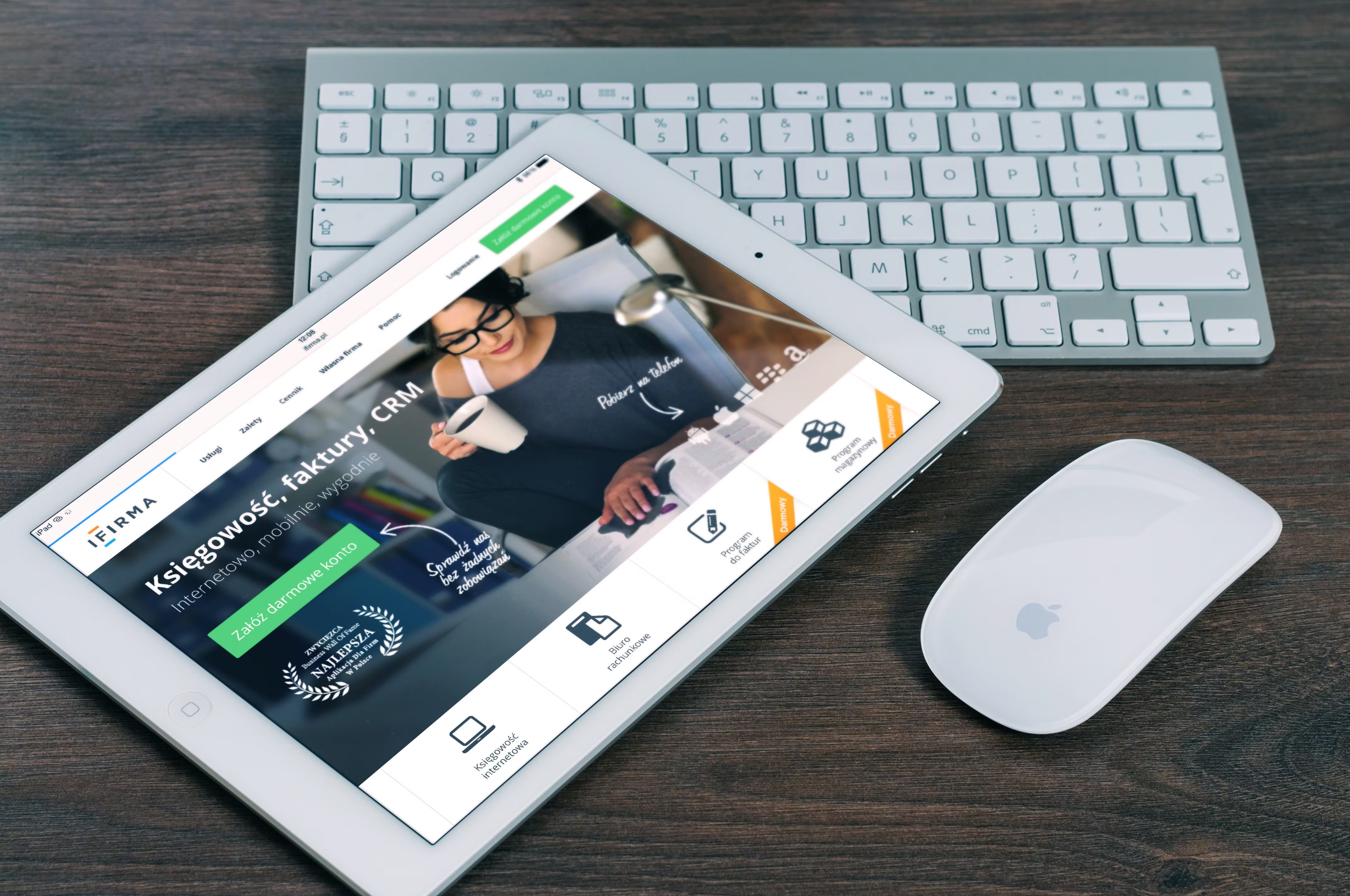
Mobile landing page design plays a central role in how well a page performs on smaller screens. When visitors arrive from search, ads, social media, or email, they usually decide very quickly whether the page feels clear, fast, and trustworthy enough to keep reading.
For Backlink Works Insights, this topic sits at the point where website design, SEO, and conversion-focused UX meet. A well-designed mobile landing page can support crawlability, mobile usability, page speed, content clarity, and better user journeys, while still giving people a simple path to enquire, subscribe, or buy.
Why mobile landing page design matters
A landing page is built to guide a visitor towards one main action. On mobile, that task becomes more demanding because screen space is limited, attention is short, and distractions are common. Good design removes friction rather than adding more elements.
From an SEO perspective, mobile-friendly design supports usability signals, accessibility, structured content, and performance. Search engines do not rank pages just because they look attractive, but design choices can influence how easily content is understood, loaded, and interacted with. That is why mobile-first design matters for business websites, service pages, ecommerce product pages, and WordPress landing pages alike.
If you are checking how a page performs overall, it can help to start with a free website SEO audit to spot issues around speed, structure, and usability before you redesign.
Start with a mobile-first page structure
Mobile-first design means planning the layout for the smallest screen first, then adapting it for larger devices. This approach helps you focus on what matters most: the headline, the value proposition, the main call to action, and the supporting proof that helps visitors feel confident.
Keep the top of the page simple. A strong headline should explain the offer in plain language. A short subheading can add context, such as who the page is for or what problem it solves. Then place one clear call to action near the top so users do not need to scroll to understand the next step.
For service pages and lead-generation pages, the structure often works best in this order: headline, short explanation, benefit-led bullet points, trust signals, supporting details, and a final action area. For ecommerce product pages, the key elements may be product title, price, images, benefits, reviews, delivery details, and add-to-basket options.
Keep the content layout focused and easy to scan
Mobile visitors rarely read in a straight line. They scan for relevance, so your content layout should make it easy to find key points quickly. Use short paragraphs, clear subheadings, and concise bullet lists where appropriate. Avoid dense blocks of text that force users to zoom or guess where the important information is.
One useful rule is to place the most important content above the fold, then repeat the call to action after key sections. This does not mean stuffing the page with buttons. It means giving users sensible opportunities to act once they have enough information.
Also think about hierarchy. Different font sizes, spacing, and contrast levels help users understand what is most important. This supports both UX and accessibility, especially for people using smaller devices or less stable connections.
Design for speed and Core Web Vitals
Page speed is not just a technical concern. It directly affects how mobile visitors experience your landing page. Slow-loading pages can feel clumsy, and that can reduce trust before the content has even appeared.
Design choices influence performance. Large images, heavy scripts, autoplay media, and too many third-party tools can all slow down a page. A cleaner layout often performs better because it gives the browser less work to do. This matters for Core Web Vitals, especially when images or layout elements shift while loading.
Use optimised images, avoid unnecessary animation, and keep interactive elements lightweight. If you build in WordPress, choose a sensible theme, limit plugin bloat, and test the page on real mobile devices. You can also check performance with PageSpeed Insights to review common issues such as loading time, responsiveness, and visual stability.
Make navigation and calls to action effortless
On a landing page, navigation should be deliberate. Some pages work better with minimal links so users stay focused on one action. However, removing all navigation is not always the right answer. For business websites and service pages, users may still need access to key supporting information, such as pricing, FAQs, contact details, or trust pages.
The best approach is usually a balanced one. Keep the primary action obvious and reduce distractions, but allow access to the most useful supporting content. Make buttons large enough to tap comfortably, use clear wording such as “Book a call”, “Request a quote”, or “View product details”, and avoid vague labels like “Submit” when a clearer phrase would help.
Internal linking can also support navigation and context when used carefully. For example, linking to a backlink building process overview can help users understand broader SEO support services without cluttering the page.
Build trust with clear UI, accessibility, and content signals
Trust is a major part of conversion-focused design. On mobile, users often make quick judgements about whether a business looks credible. Clean UI, readable typography, consistent spacing, and simple forms all help create that sense of professionalism.
Trust signals should be honest and relevant. These might include company details, service descriptions, real contact methods, delivery information, warranty terms, or explanations of the process. For ecommerce sites, product pages should show accurate product information and clear return details. For consultants or agencies, service pages should explain deliverables, timelines, and expectations clearly.
Accessibility also matters. Use strong colour contrast, descriptive button text, sufficient spacing between tap targets, and alternative text for important images. Good accessibility is part of good UX, and it helps more visitors use the page comfortably.
Test, measure, and improve the page over time
Mobile landing page design is not a one-time task. The best pages are reviewed and refined based on user behaviour, analytics, and feedback. Look at where users drop off, which sections get attention, and whether the call to action is easy to find on different screen sizes.
Tools such as heatmaps, session recordings, and form analytics can help you see where people hesitate. You may find that the headline is clear but the form is too long, or that the page loads well but the main message is buried too far down. Small improvements in layout and clarity can make the page easier to use.
If you are designing for WordPress, ecommerce, or service-based business pages, treat each landing page as a testable asset rather than a fixed template. A simple checklist can help:
- Does the headline explain the offer quickly?
- Is the main call to action visible on mobile?
- Are images optimised and relevant?
- Is the layout easy to scan?
- Do trust signals feel genuine and useful?
- Does the page load quickly on mobile networks?
Conclusion
Mobile landing page design is about more than appearance. It affects how easily visitors understand your message, how quickly the page loads, how confidently users trust the offer, and how smoothly they can take action. In that sense, good design supports SEO, UX, accessibility, and conversion-focused performance at the same time.
For website owners, marketers, designers, and developers, the most effective mobile landing pages are usually the simplest ones: clear structure, strong hierarchy, fast loading, readable content, and honest calls to action. If you keep those principles in mind, your landing pages will be better placed to serve both users and business goals.
Frequently Asked Questions
What is mobile landing page design?
It is the process of creating landing pages that work well on smartphones and tablets, with clear content, fast loading, and easy-to-tap actions.
How does mobile design affect SEO?
Good mobile design supports usability, accessibility, page speed, and content structure, which can all help search engines understand and serve the page more effectively.
What should a mobile landing page include first?
Start with a clear headline, a short supporting message, and one obvious call to action so visitors understand the offer quickly.
Should mobile landing pages have navigation?
Sometimes yes, but keep it minimal. Use only the links that genuinely help users without distracting them from the page’s main goal.
- Sponsored Ad -


