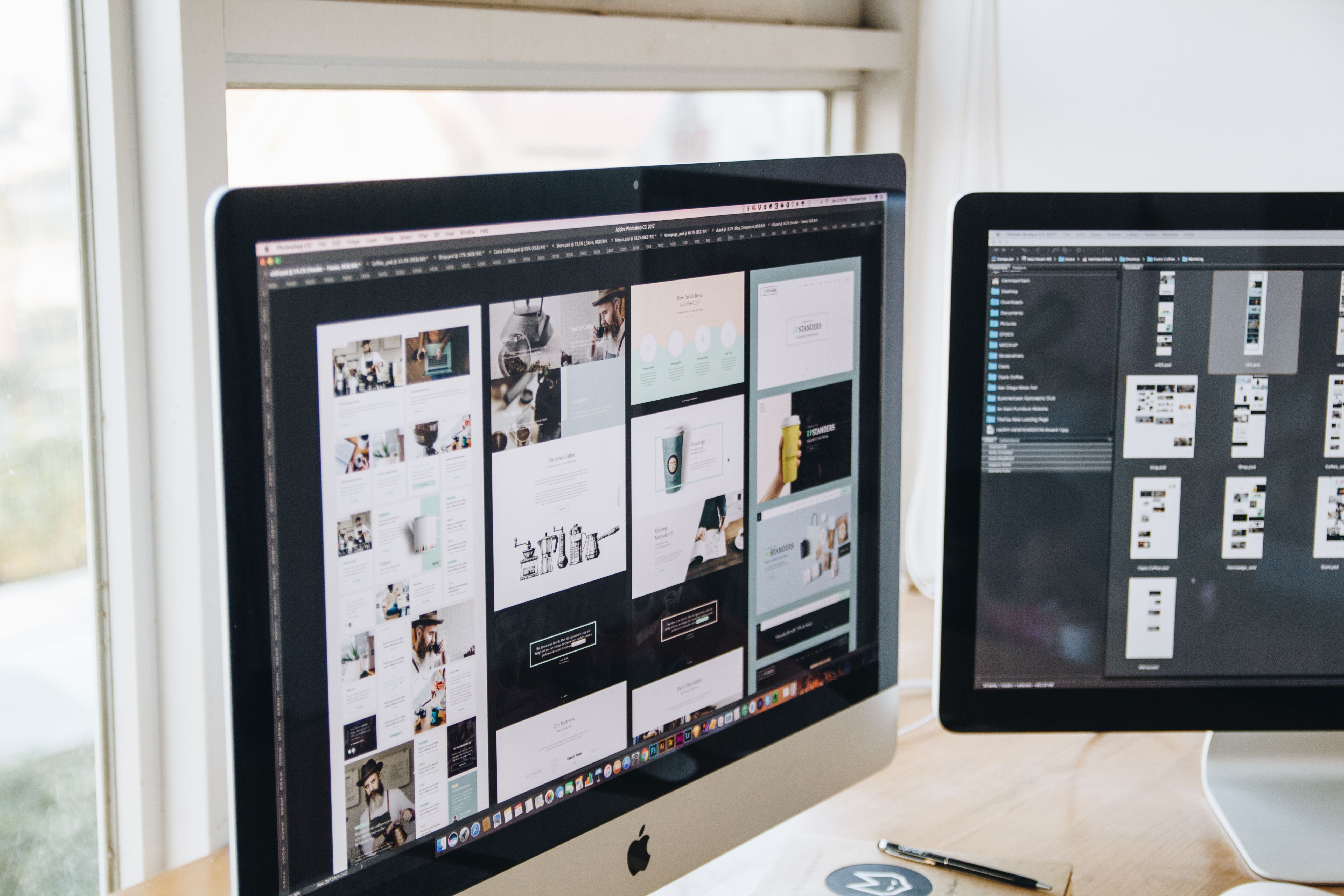
Redesigning a website is not just about giving it a fresh look. A good redesign should make the site easier to use, faster to load, clearer to navigate, and more effective at turning visitors into enquiries, purchases, or sign-ups. When done well, website design supports SEO by improving crawlability, mobile usability, content structure, accessibility, internal linking, and overall user experience.
For business websites, ecommerce stores, service pages, and WordPress sites, a redesign is often the right time to fix issues that slow users down. It is also a chance to align the layout, messaging, and technical setup with what people actually need from the site. If you are planning a redesign, a free website SEO audit can help you spot structural and performance issues before you rebuild.
Start with the purpose of the redesign
Before changing colours, fonts, or page templates, define what the redesign needs to achieve. Some sites need better lead generation. Others need stronger product discovery, clearer service pages, or a more trustworthy brand experience. The goal should shape every design decision.
Start by reviewing your current site data. Look at where users enter, where they leave, which pages convert, and which pages cause confusion. Analytics, heatmaps, search console data, and user feedback can all help you understand where design is helping and where it is getting in the way.
It is also useful to identify the most important user journeys. For example, a service business might want visitors to move from a homepage to a service page and then to a contact form. An ecommerce brand may want users to go from category pages to product pages and then to checkout. A redesign should make those journeys simpler, not longer.
Map the new structure before designing the pages
Good website structure makes it easier for users and search engines to understand what the site offers. If pages are buried too deeply, grouped poorly, or linked inconsistently, even a visually attractive site can feel hard to use. Structure matters for SEO-friendly website design because it helps crawlers discover content and helps visitors find what they need.
Start with a clear sitemap. Group pages by intent rather than by internal department. For example, a business website might separate core services, industries, case studies, and resources. An ecommerce site might organise products by category, use case, and featured collections. Keep navigation simple and avoid forcing users to guess where to click next.
Pay close attention to internal links. Service pages should lead naturally to related services, FAQs, proof points, and contact options. Product pages should connect to related items, delivery information, returns, and support content. Internal linking improves clarity and can support SEO by creating stronger topical paths across the site.
Keep navigation simple and predictable
Main navigation should show the most important pages first. Use labels people understand, not internal jargon. If users have to pause and think about menu terms, the design is working against them. On mobile, navigation should be easy to tap and not overcrowded.
Design for mobile-first behaviour and responsive layouts
Mobile-first design means planning for smaller screens first, then scaling up. This is especially important because many users browse, compare, and buy on phones. A responsive website should adapt smoothly across screen sizes without breaking layouts, hiding key content, or making buttons hard to use.
On mobile, keep content blocks concise and scannable. Use enough spacing between tap targets. Avoid fixed-width elements that force horizontal scrolling. Make forms short and easy to complete. If a quote request, booking form, or checkout step feels awkward on mobile, conversions can suffer even when the traffic is strong.
Responsive design also supports SEO and usability by helping one page work well across devices. That means consistent content, readable typography, and layouts that stay usable whether a visitor is on a laptop, tablet, or phone. Tools such as web.dev design guidance can be useful when reviewing responsive behaviour and mobile usability.
Improve page layout, UX, and content clarity
Users rarely read a page from top to bottom. They scan for signs that the page matches their intent. That means layout matters as much as copy. A strong redesign should make key information easy to spot, with clear headings, concise paragraphs, visible calls to action, and enough white space to reduce strain.
Each important page should answer a user’s main questions quickly. On a service page, that may include what the service is, who it is for, what the process looks like, and how to get started. On a product page, it may include features, benefits, pricing, delivery details, and trust signals. On a landing page, it should focus on one clear action without unnecessary distractions.
UI choices should support the content rather than compete with it. Use a consistent visual system for buttons, forms, icons, and cards. Avoid too many competing colours or styles. The cleaner the interface, the easier it is for users to understand what matters next.
Use trust signals where they belong
Trust signals should feel natural and helpful, not forced. Relevant testimonials, accreditations, delivery details, policies, and contact information can reassure users when placed near decision points. For service businesses, this might mean showing proof near enquiry forms. For ecommerce, it might mean clear shipping and returns information near the add-to-basket area.
Make speed and Core Web Vitals part of the design plan
Website speed affects user experience, mobile performance, and search visibility. A redesign is the right time to reduce unnecessary weight and simplify how pages load. Core Web Vitals are useful measures to consider because they reflect how quickly content appears, how stable layouts feel, and how responsive the page is to interaction.
Design choices can slow a site down. Large images, too many scripts, heavy animations, and oversized page builders can all affect performance. For WordPress website design, this often means choosing a lightweight theme, using optimised media, and limiting plugins to what is actually needed. On ecommerce sites, it may mean reviewing product image sizes, filter behaviour, and script loading on category pages.
Speed should be tested on real pages, not assumed from design mock-ups. Before launch, check page performance on key templates such as the homepage, service pages, product pages, and landing pages. If you want a quick benchmark, PageSpeed Insights is a practical place to review loading behaviour and performance opportunities.
Build landing pages and conversion paths with intent
Conversion-focused design does not mean adding aggressive tactics. It means making the next step obvious and easy. A good redesign aligns layout, copy, and calls to action so users can move forward with confidence. The best results depend on traffic quality, offer clarity, trust signals, page design, and testing.
Landing pages should reduce distractions and focus on a single goal. If the aim is enquiries, keep the page centred on one form, one offer, and one clear message. If the aim is sales, the page should support decision-making with product details, benefits, FAQs, and reassurance around delivery or support. If the aim is newsletter sign-ups or lead magnets, the value exchange should be explicit and easy to understand.
Do not hide important content below unclear buttons or bury action points in long blocks of text. Make the primary call to action visible and repeated at sensible points in the page. At the same time, keep the page honest and useful. Good conversions come from clarity, not pressure.
Test, review, and improve after launch
A redesign is not finished when the new site goes live. The real work begins when users start interacting with it. Monitor how people move through key pages, where they stop, and where they complete important actions. This is especially important for service pages, product pages, contact flows, and checkout steps.
Look for signs that the design is not matching user intent. Common issues include confusing menus, weak page hierarchy, slow mobile pages, low-contrast text, forms that are too long, and calls to action that are not easy to find. Fixing these problems after launch can improve usability and make the site easier to maintain.
If you are redesigning for online visibility as well as usability, it can help to compare your pages with technical SEO guidance from trusted sources such as Google’s SEO Starter Guide. This is not about chasing shortcuts; it is about making sure the structure, content, and experience support discoverability.
Backlink Works Insights often approaches redesign as a business and search strategy, not just a visual refresh. That mindset helps keep the project focused on what users need and what the site needs to perform well.
Conclusion
Redesigning a website for better UX, speed, and conversions is about making the site more useful, more understandable, and easier to trust. A strong redesign improves structure, navigation, mobile usability, page layout, performance, and content clarity while supporting SEO through accessibility, crawlability, internal linking, and better user experience.
Whether you are working on a WordPress site, an ecommerce store, or a service-based business website, the best results usually come from careful planning and testing. Focus on what users need, keep the design clear, and use data to guide improvements after launch.
Frequently Asked Questions
What should I check before redesigning a website?
Review analytics, top pages, user journeys, technical issues, mobile usability, and content gaps. This helps you redesign based on evidence rather than assumptions.
How does website design affect SEO?
Design affects how easily search engines and users can access, understand, and navigate content. Good structure, mobile usability, speed, and internal linking all support SEO.
What makes a website more conversion-focused?
Clear messaging, simple navigation, strong page hierarchy, visible calls to action, trust signals, and a smooth mobile experience all help users complete the next step.
Should I redesign all pages at once?
Not always. It is often better to prioritise key templates first, such as the homepage, service pages, product pages, and landing pages, then improve other areas in phases.
- Sponsored Ad -


