
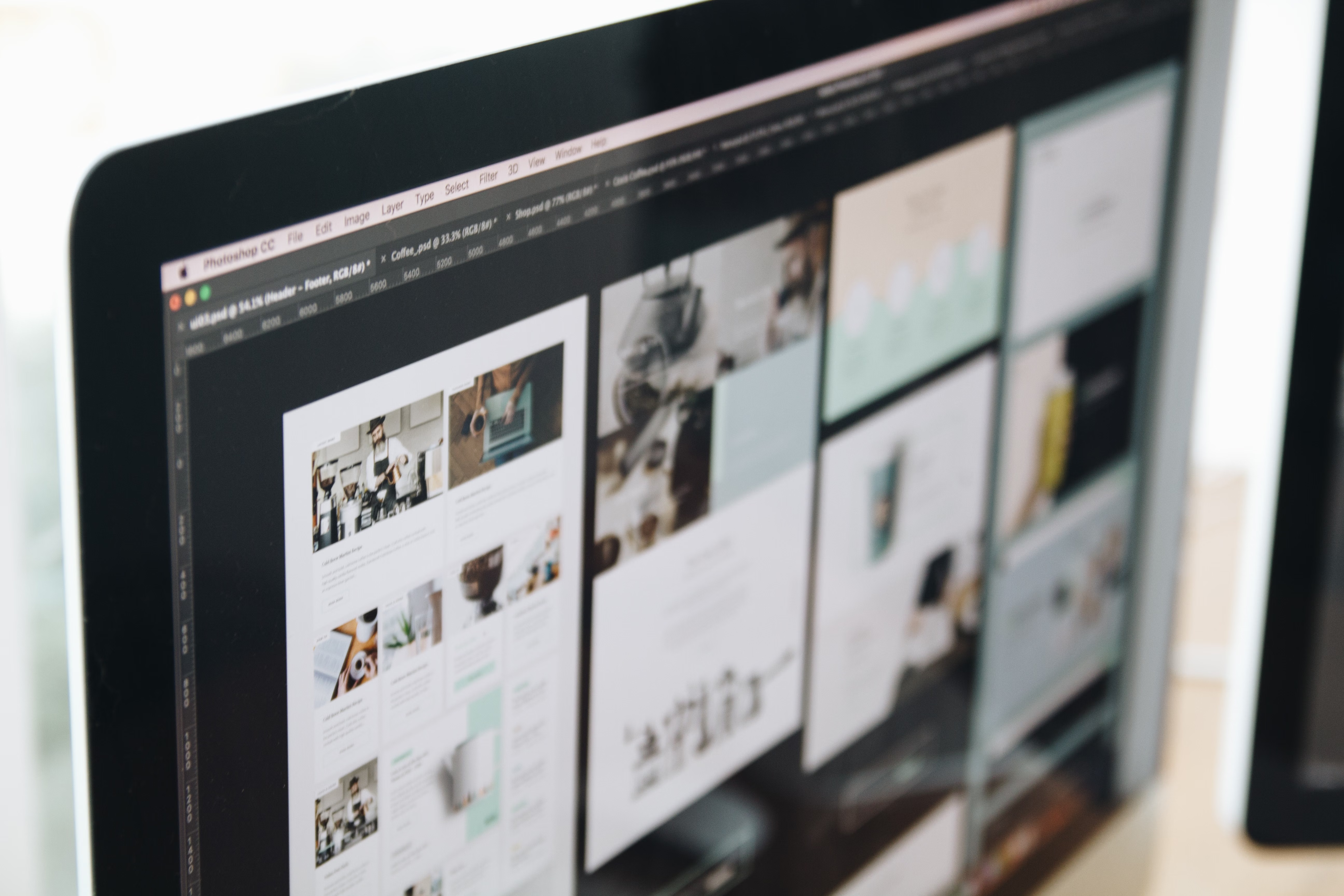
Website design does far more than shape how a site looks. It influences whether search engines can understand your content, whether visitors can use your pages easily on mobile, and whether people feel confident enough to take action. In other words, design affects SEO, speed, and conversions at the same time.
For business websites, ecommerce stores, service pages, and blogs, strong design supports performance across the whole site. It helps search engines crawl important pages, improves reading flow, reduces friction, and makes it easier for users to find what they need. If you want a useful starting point, a free website SEO audit can help you spot technical and design-related issues that may be holding a site back.
How website design supports SEO
Search engines do not rank a site because it looks attractive. They assess whether pages are useful, accessible, well structured, and easy to interpret. Good website design supports SEO by creating clear page layouts, logical headings, strong internal linking, and a structure that helps crawlers understand what each page is about.
For example, if a service website has one clear page for each offering, supported by related content and sensible navigation, it is easier for search engines to discover and index those pages. The same applies to ecommerce website design, where product categories, filters, and product pages should be organised in a way that helps both users and search engines.
Design also affects indexability through content placement. Important text should be visible in the HTML, not hidden behind awkward interactions or embedded in images. If users can only reach key content through complicated design elements, search engines may struggle too. Google’s own Search Central guidance is a useful reference for understanding how design choices connect to search visibility.
Why mobile-first and responsive design matter
Most websites are now used on phones as well as desktops, so responsive web design is no longer optional. A mobile-first approach means designing for smaller screens first, then enhancing the experience for larger ones. This usually leads to cleaner layouts, simpler navigation, and clearer content priorities.
On mobile, small design decisions have a big effect. Buttons need enough space to tap comfortably, text must remain readable without zooming, and forms should be easy to complete. If the layout is cramped or difficult to use, visitors are more likely to leave before they read enough to trust the offer.
Mobile usability also connects to SEO. Pages that are hard to use on a phone can create poor engagement signals and weaker user satisfaction. For business websites and landing pages, responsive design helps ensure that calls to action, testimonials, service details, and contact options remain visible and functional across devices.
Website structure, navigation, and content layout
Website structure tells users where they are and where they can go next. Clear navigation, sensible categories, and well planned page hierarchies help visitors move through the site without confusion. They also support internal linking, which helps distribute authority and guide search engines through related topics.
Good content layout makes important information easy to scan. Use headings, short paragraphs, lists, and visual breathing room so that users can quickly understand the main points. This is especially important for service pages and product pages, where people often want fast answers about benefits, features, pricing, delivery, or next steps.
Landing pages work best when the design supports one clear goal. That might be booking a call, requesting a quote, or buying a product. Too many competing links, unnecessary banners, or cluttered sections can distract from that goal. Conversion-focused design is not about pressure tactics; it is about clarity, relevance, and reducing friction.
How design affects website speed and Core Web Vitals
Design choices can significantly affect website performance. Large uncompressed images, heavy animations, too many fonts, and bloated page builders can slow loading times. This matters because slow pages frustrate users and may reduce engagement, especially on mobile connections.
Core Web Vitals are a useful way to think about user experience and performance together. They focus on how quickly content appears, how stable the page feels as it loads, and how responsive the page is when users interact with it. A visually polished page is not helpful if it loads slowly or shifts around while someone is trying to click a button.
WordPress website design often needs extra attention here because themes and plugins can add useful features, but also unnecessary weight. Choosing a well built theme, limiting plugins, and optimising media can improve both speed and usability. Testing with tools such as PageSpeed Insights can help identify performance issues tied to design decisions.
Design elements that influence conversions
Conversions depend on more than design alone, but design plays a major role in how persuasive a page feels. Clear hierarchy, strong spacing, visible trust signals, and focused calls to action help visitors understand what to do next. A page that looks organised and professional can reduce hesitation, especially for new visitors.
For service businesses, this might mean placing contact details, service summaries, and proof points near the top of the page. For ecommerce brands, it could mean making product images, pricing, stock information, shipping details, and add-to-cart buttons easy to find. For bloggers and consultants, it may involve making key content, newsletter sign-ups, or enquiry links simple to access without overwhelming the reader.
Results vary based on traffic quality, offer strength, copywriting, trust signals, and user intent. A well designed page can improve the conditions for conversion, but it should be tested and refined rather than assumed to work perfectly from the start.
Best practices for SEO-friendly website design
When planning a new site or improving an existing one, it helps to focus on practical best practices rather than design trends alone. A useful checklist includes:
- Use a clear site structure with logical categories and subpages.
- Keep navigation simple and easy to understand.
- Make headings meaningful and consistent.
- Design for mobile first, then refine for larger screens.
- Optimise images and avoid unnecessary visual weight.
- Place important content where users expect to find it.
- Use internal links to connect related pages naturally.
- Keep forms short and friction-free.
- Check contrast, readability, and accessibility.
Accessibility is not just a compliance issue; it is part of good design. Clear labels, strong colour contrast, keyboard-friendly navigation, and descriptive link text help more people use your site effectively. They also improve clarity for search engines and create a better overall experience for everyone.
For teams building or redesigning a site, it is often useful to think in terms of user journeys. What does a visitor need to see first, second, and third before they feel ready to act? The best layouts answer that question without making people work for basic information. If you are planning a broader SEO improvement alongside design changes, Backlink Works provides educational resources that can support a more structured approach to website growth.
Conclusion
Website design affects SEO, speed, and conversions because it shapes how people and search engines experience a site. A well designed website is easy to crawl, simple to use on mobile, fast to load, and clear about what each page should achieve. That combination supports better visibility and a smoother path from visit to enquiry, sale, or subscription.
The most effective design work is usually practical: improve structure, simplify navigation, reduce page weight, strengthen readability, and make key actions obvious. When design, content, and performance work together, a website is better positioned to support long-term growth.
Frequently Asked Questions
Does website design directly improve SEO?
Not by itself. Design helps SEO by improving crawlability, mobile usability, page structure, accessibility, and user experience.
What design changes usually help page speed?
Compressing images, reducing unnecessary scripts, using lighter themes, and simplifying page layouts can all improve speed.
How does design affect conversions?
Good design makes pages clearer, more trustworthy, and easier to use, which can support conversions depending on traffic and offer quality.
Is mobile-first design important for all websites?
Yes. Most sites are used on mobile devices, so designing for smaller screens first helps with usability, readability, and performance.
- Sponsored Ad -





